One of the most important techniques in making graphics and text easy to read and pleasing to the eye on-screen is anti-aliasing.
 Anti-aliasing is a nifty way of getting round the low resolution of the computer monitor and making objects appear as smooth as if they'd just stepped out of a 1200dpi printer (nearly).
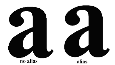
Take a look at the image. The letter a on the left is un-anti-aliased and looks coarse compared with the letter on the right.
The example here is the same letter, same point size and everything, but with anti-aliasing turned on in Photoshop's text tool. Photoshop has substituted shades of grey around the edges which would otherwise be broken across a pixel giving you jagged edges. By making a slightly fuzzy edge the eye sees smooth curves.
The next time you are bothered with the "jaggies" check the Option Palette in the Tool bar when you have the Text tool selected. Make sure you have selected one of the anti-alias options for your text. In the example below I used the Sharp anti-alias. Feel free to experiment with the other 3 anti-alias options .

No comments:
Post a Comment